|
Wells Book Arts Center residency
Aurora, New York state April 2017 |
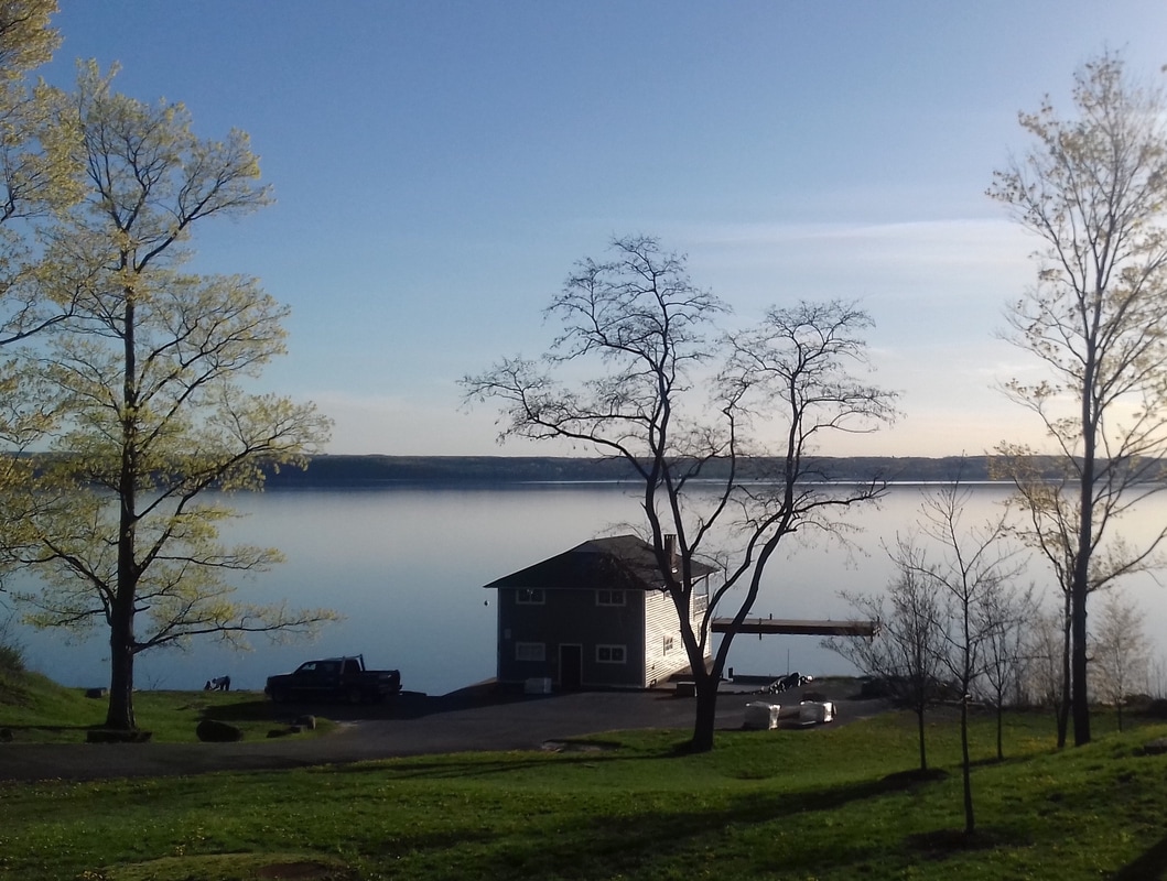
I was fortunate to spend 10 days as visiting artist at Wells Book Arts Center at the invitation of director Richard Kegler. The Center is part of Wells College, a liberal arts institution in the town of Aurora on Cayuga Lake in upstate New York. It's a very peaceful location overlooking the lake, ideally suited to a period of reflection and working on new ideas, and the Center itself is really well-equipped.
I used the time to work through a new idea that's been with me for a while. How can I depict response to place only using text, but arranged so it also represents that landscape - or a composite of landscapes - figuratively? Or, semi-figuratively, at least. I'm interested in how apparent this is to anyone but me. A mentor of mine last year suggested I might think of such work as "traces". |
|
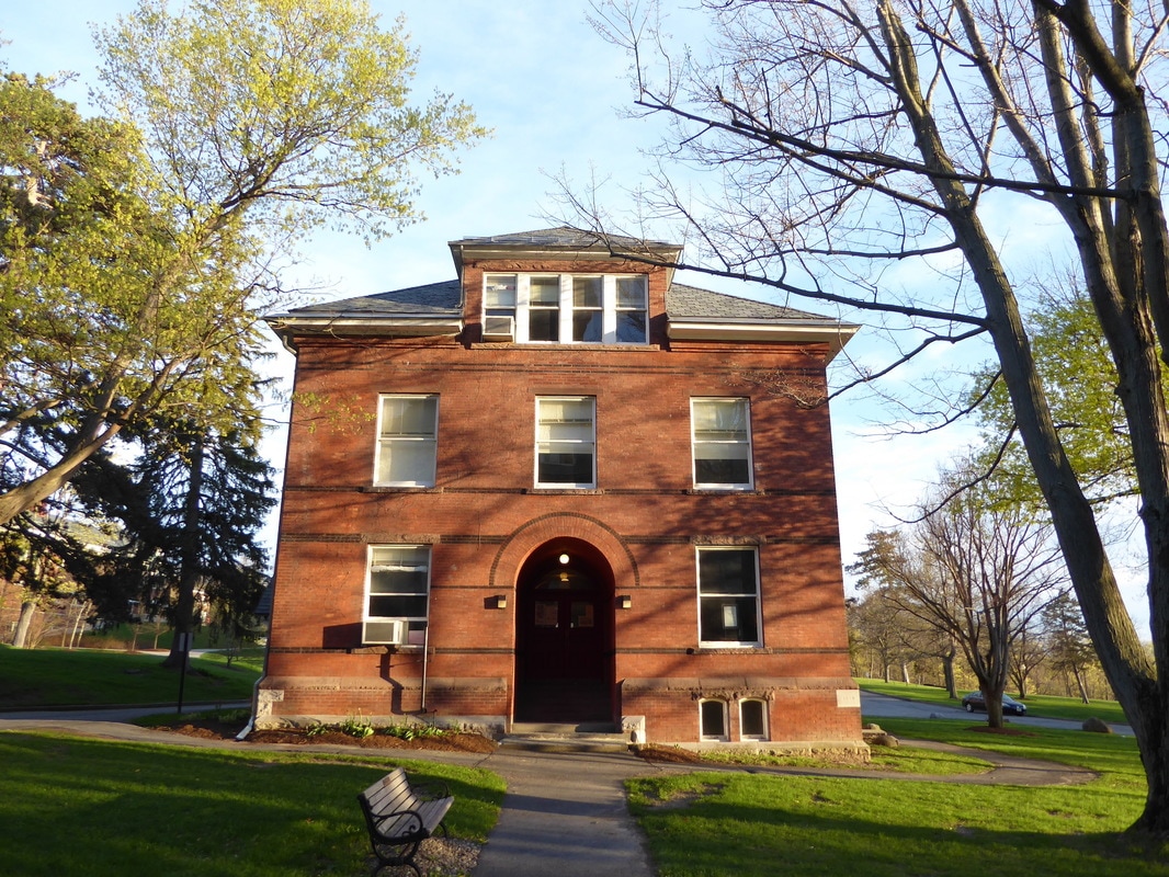
Wells Book Arts Center.
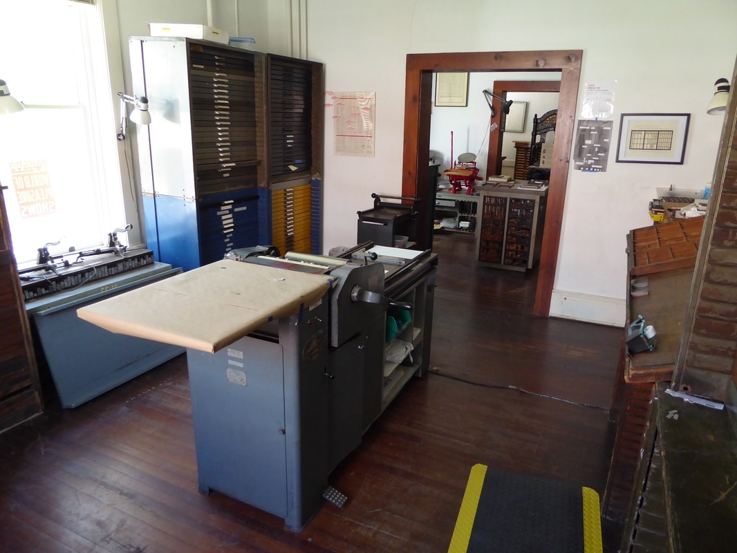
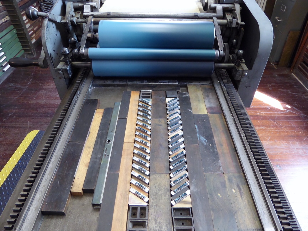
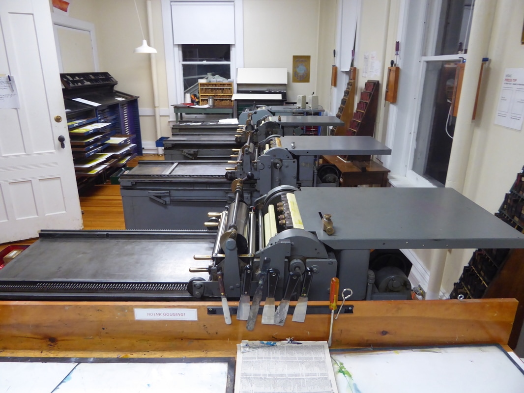
The studio space made available for me, featuring a Vandercook Universal 1.
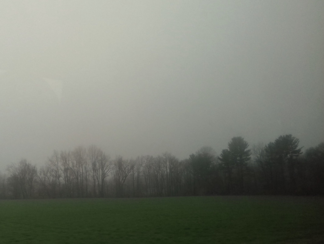
View from the Greyhound bus en route from NYC to Ithaca. The journey suggested starting points for texts and language to work with: fog and murk; leaf-less trees, spiky and skeletal; diffused, pale light.
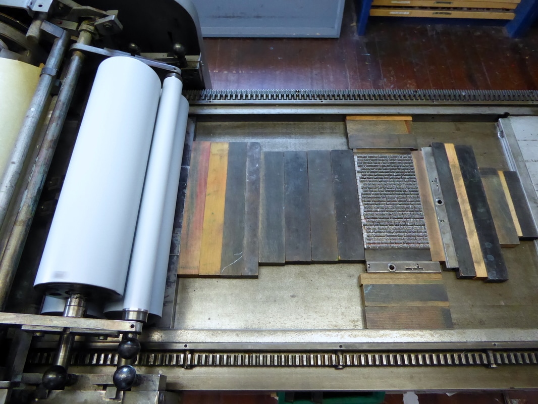
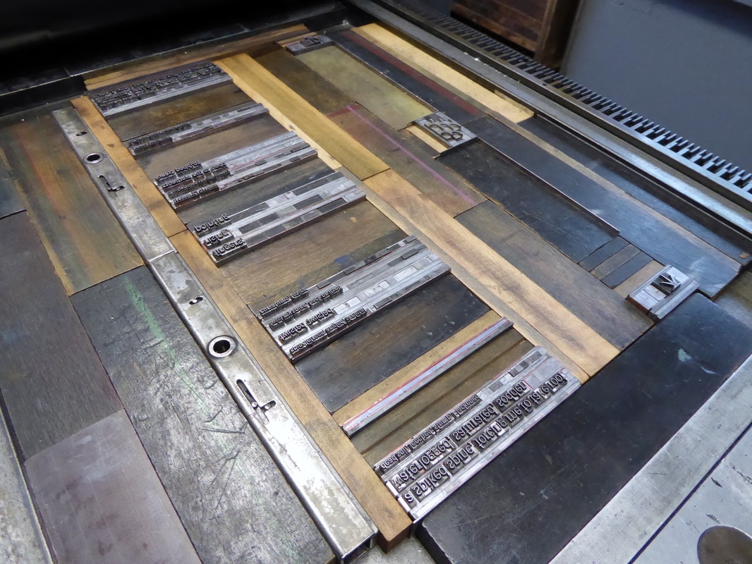
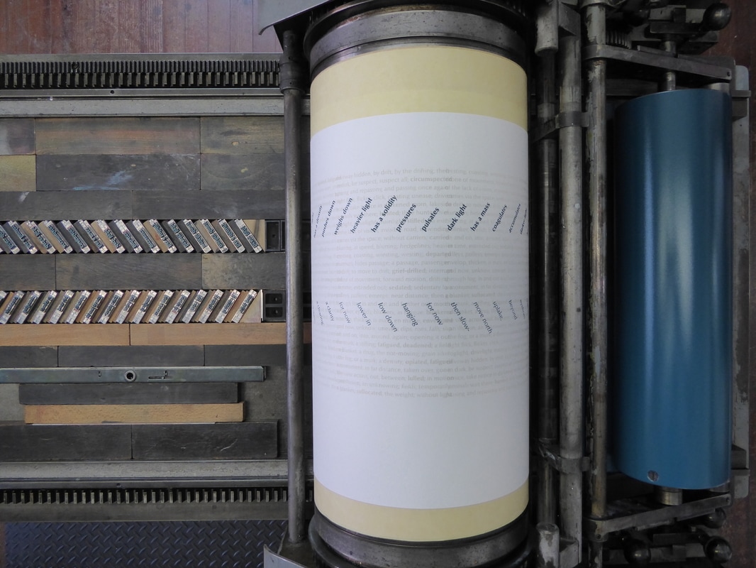
First colour: opaque white. One forme, set in Optima, moved along the press bed in four positions.
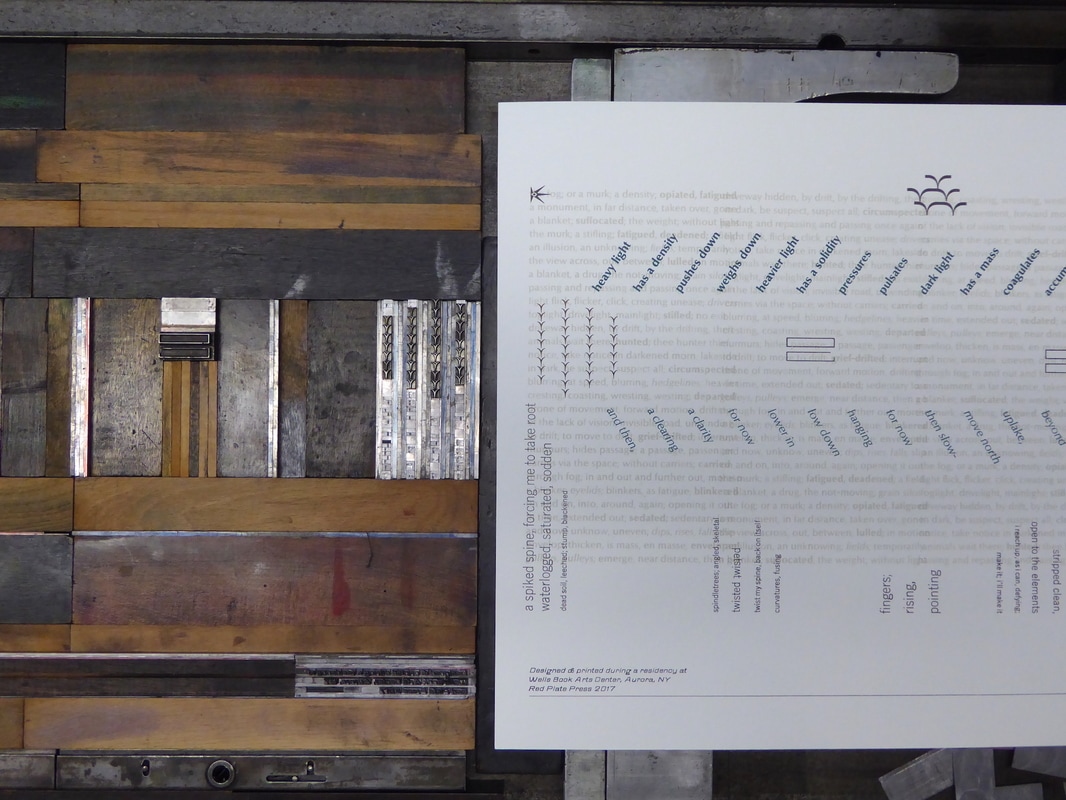
Second colour: blue gradient. Type set at an angle using triangular furniture.
Third colour: texts 'written' while setting type.
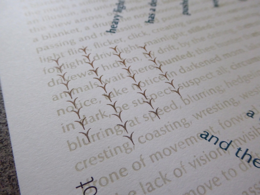
Third colour down: vertical texts and borders/ornaments.
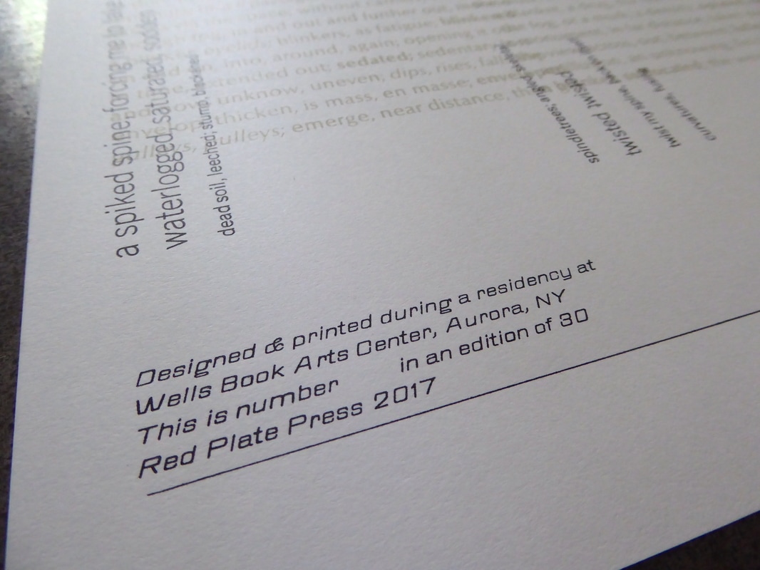
Fourth colour: Oblique Gothic used for colophon.
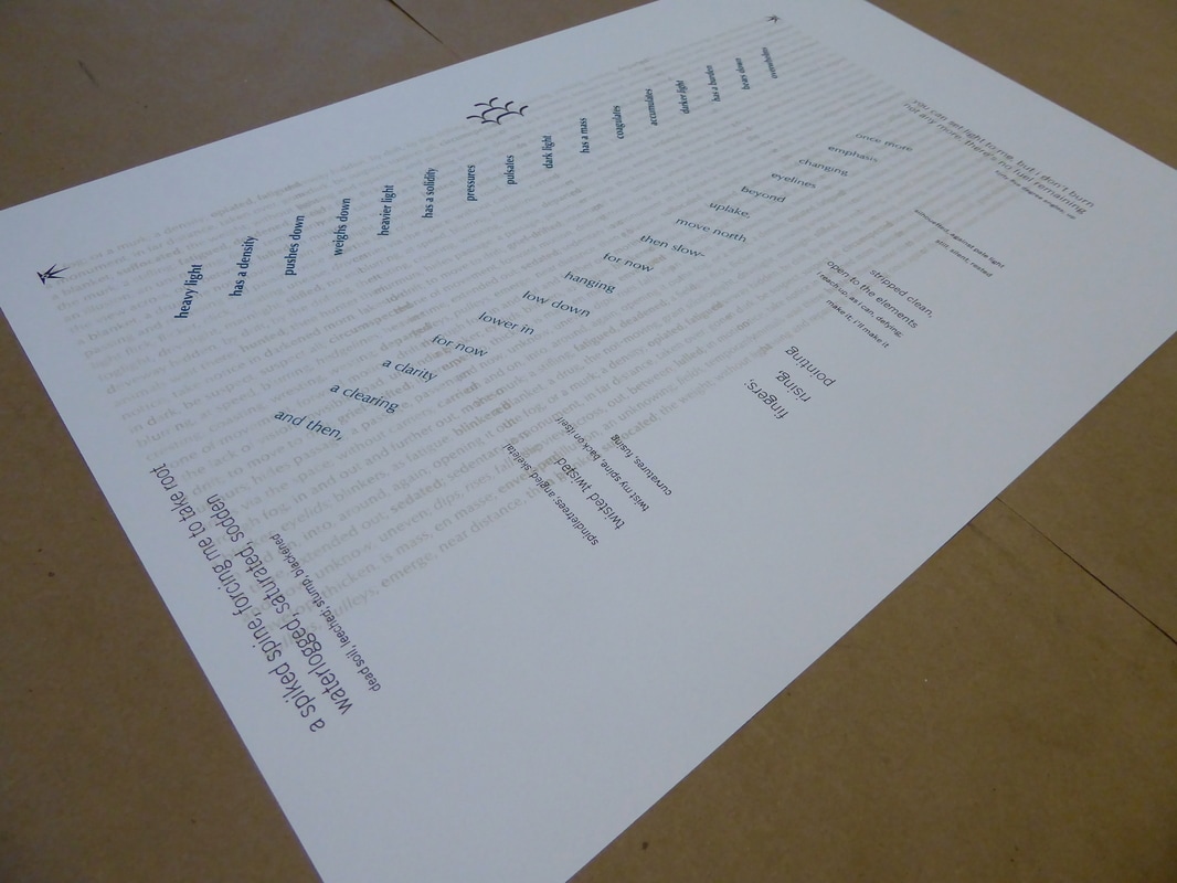
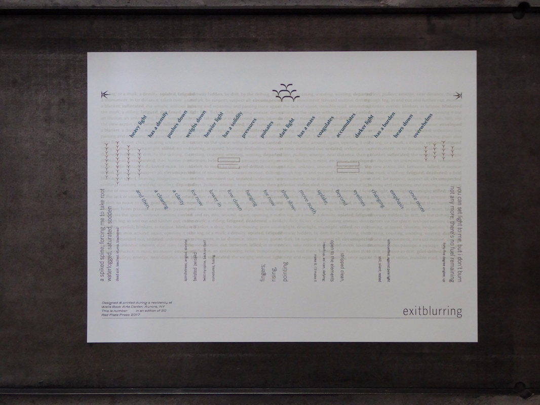
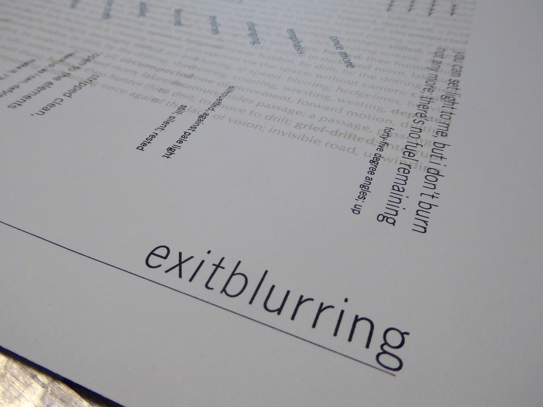
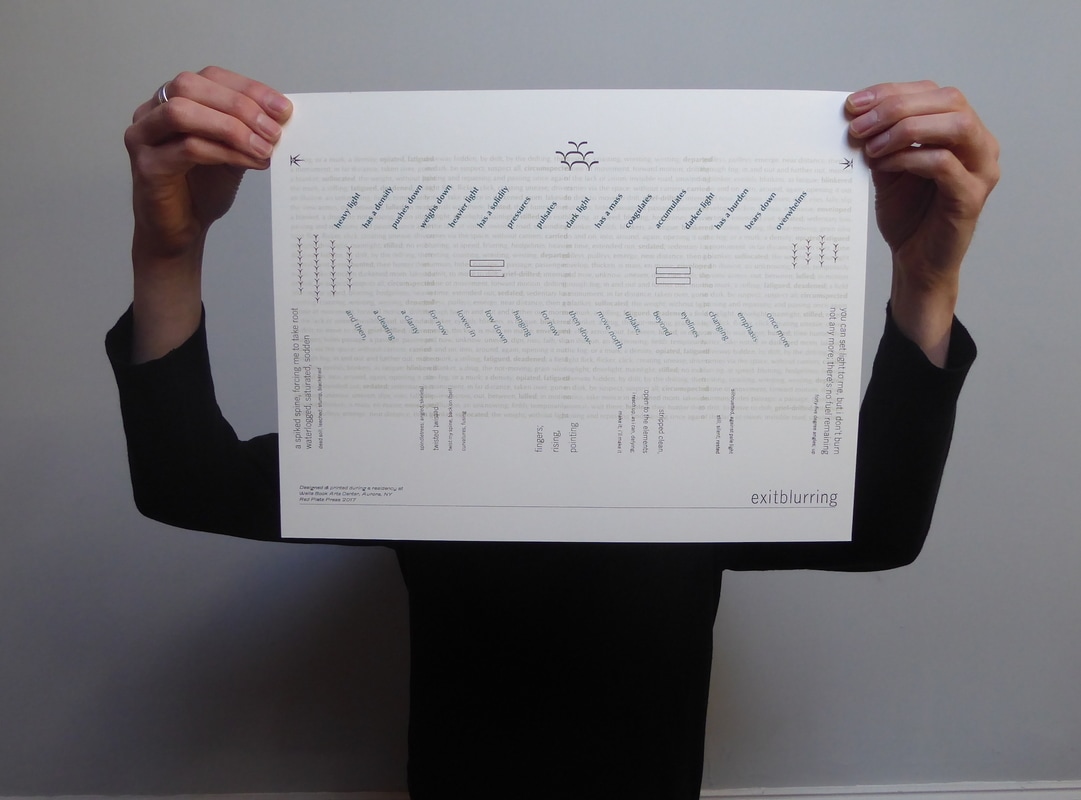
The final piece: 'exitblurring'.
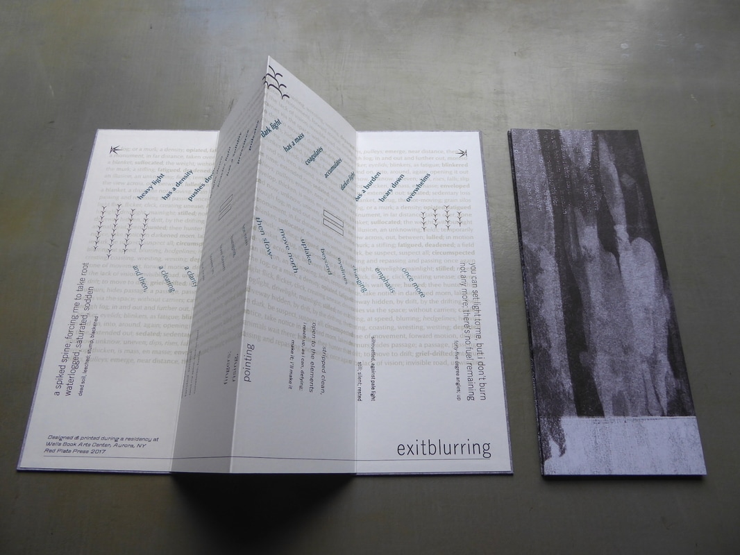
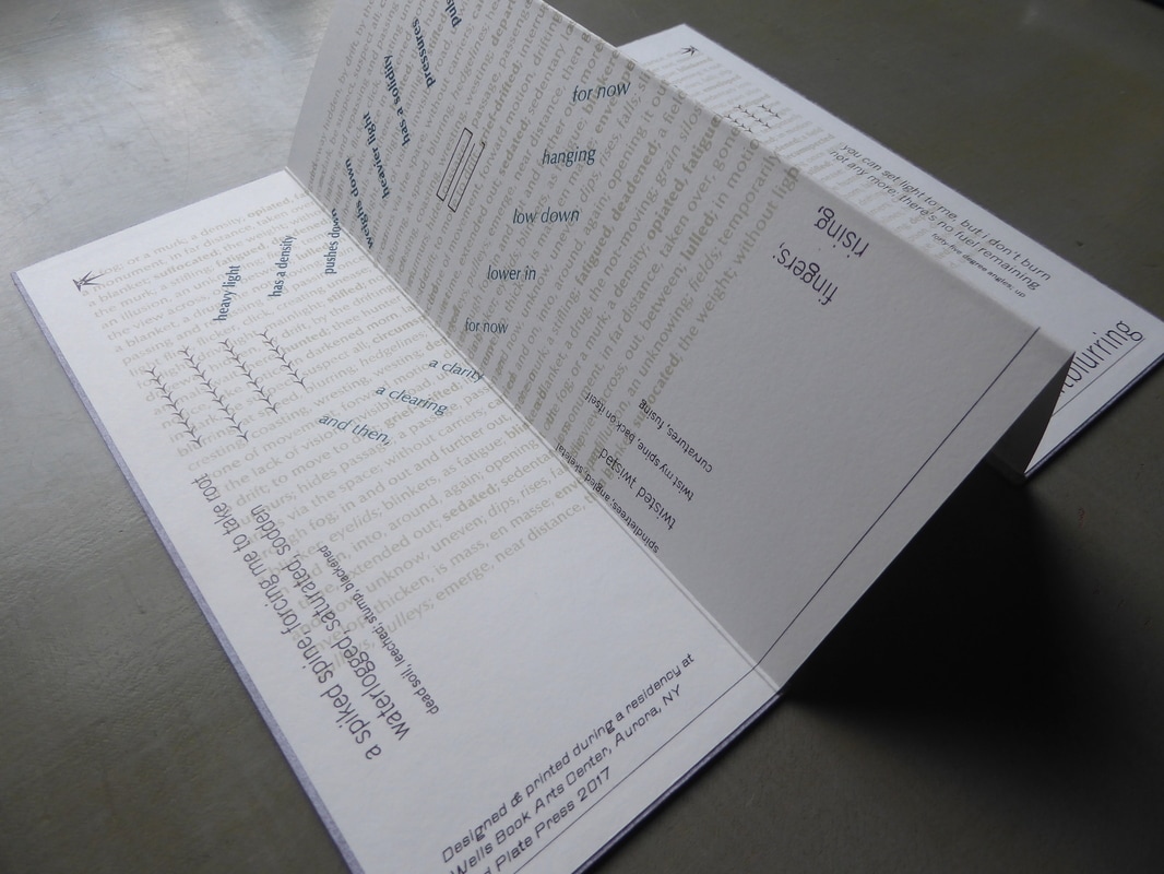
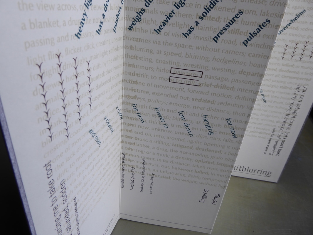
The print was also adapted into a book form on heavier weight paper.
And finally... do you want to watch type being dissed? Of course you do.
|
Cayuga Lake, from the college campus.
The student press room.
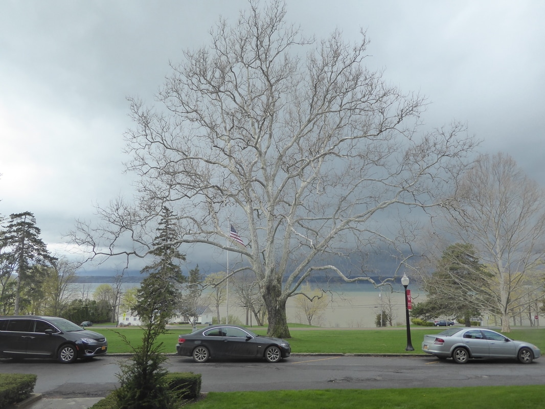
View of Cayuga Lake from my accommodation. The different bands of colour in the lake were striking. Sitting here with a coffee each morning, the weather moved slowly northwards up the lake.
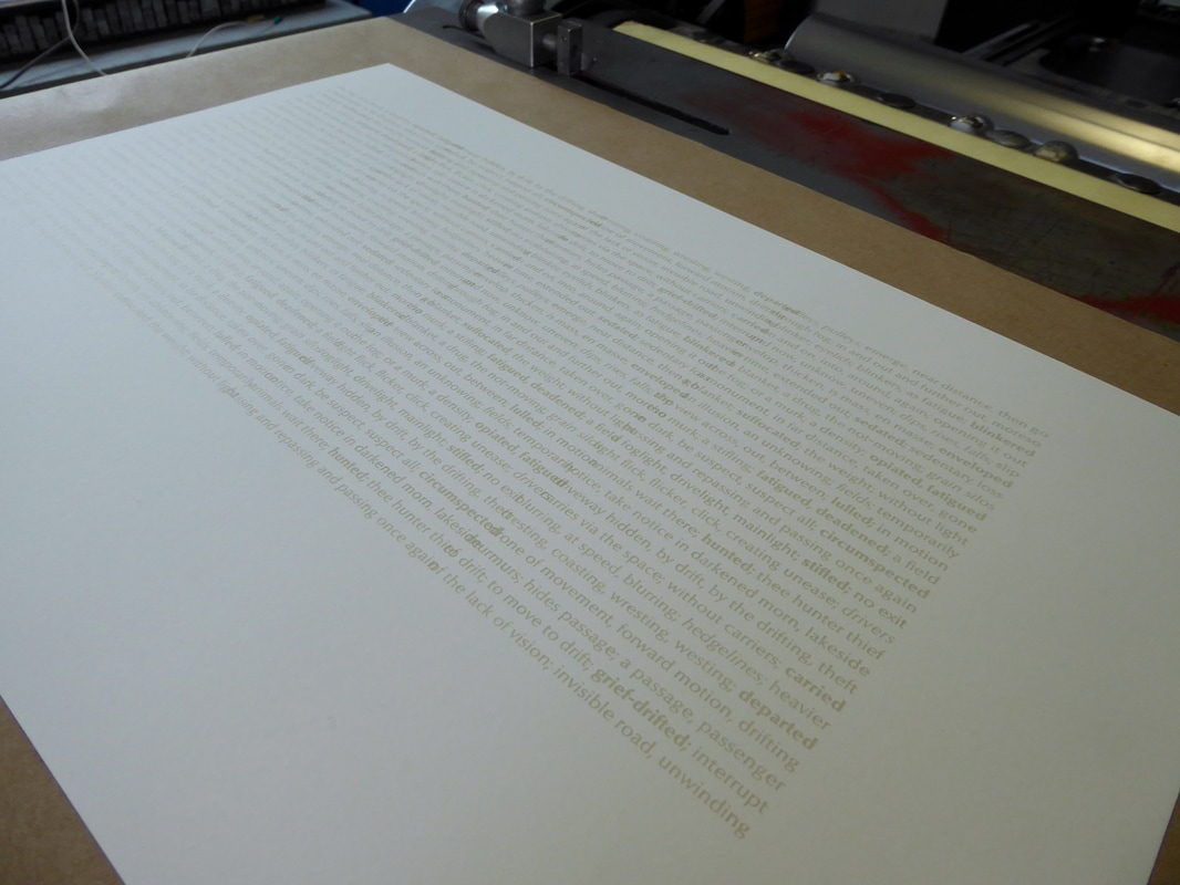
Opaque white ink reacting to Mohawk eggshell white paper. Representing that fog and diffused light.
Light bands moving along/across background texts.
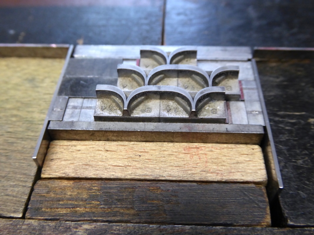
Borders from the Bixler Letterfoundry.
The Center has a fantastic type archive with unused type from years past ready for new projects.
Fourth colour: title, colophon and more ornaments arranged into bird-like patterns.
The final piece: 'exitblurring'.
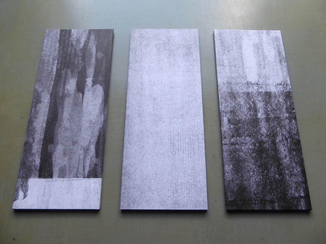
A simple concertina form, each with a different cover (produced during press wash-up).
Acknowledgements
This trip was a follow-on from my Autumn 2016 visit to Chicago and Wisconsin where I attended the annual Hamilton Wayzgoose and was hosted by Starshaped Press as artist-in-residence. Both trips were funded by a grant from the joint Arts Council England/British Council Artists' International Development Fund. Thanks also to Richard Kegler, Director of Wells Book Arts Center and Heather Buechler, current Victor Hammer Fellow at Wells, for their help and good company during the residency. |
